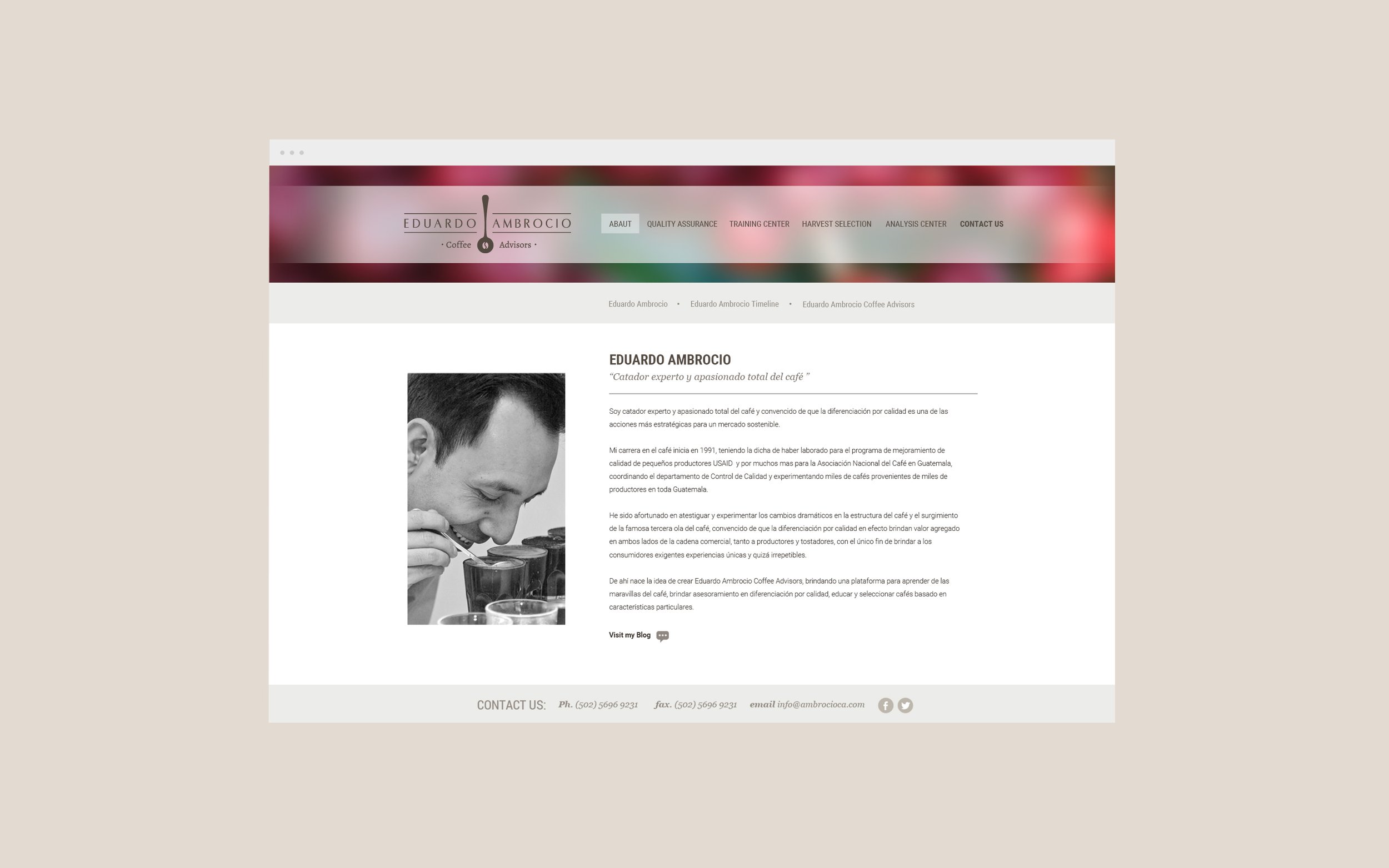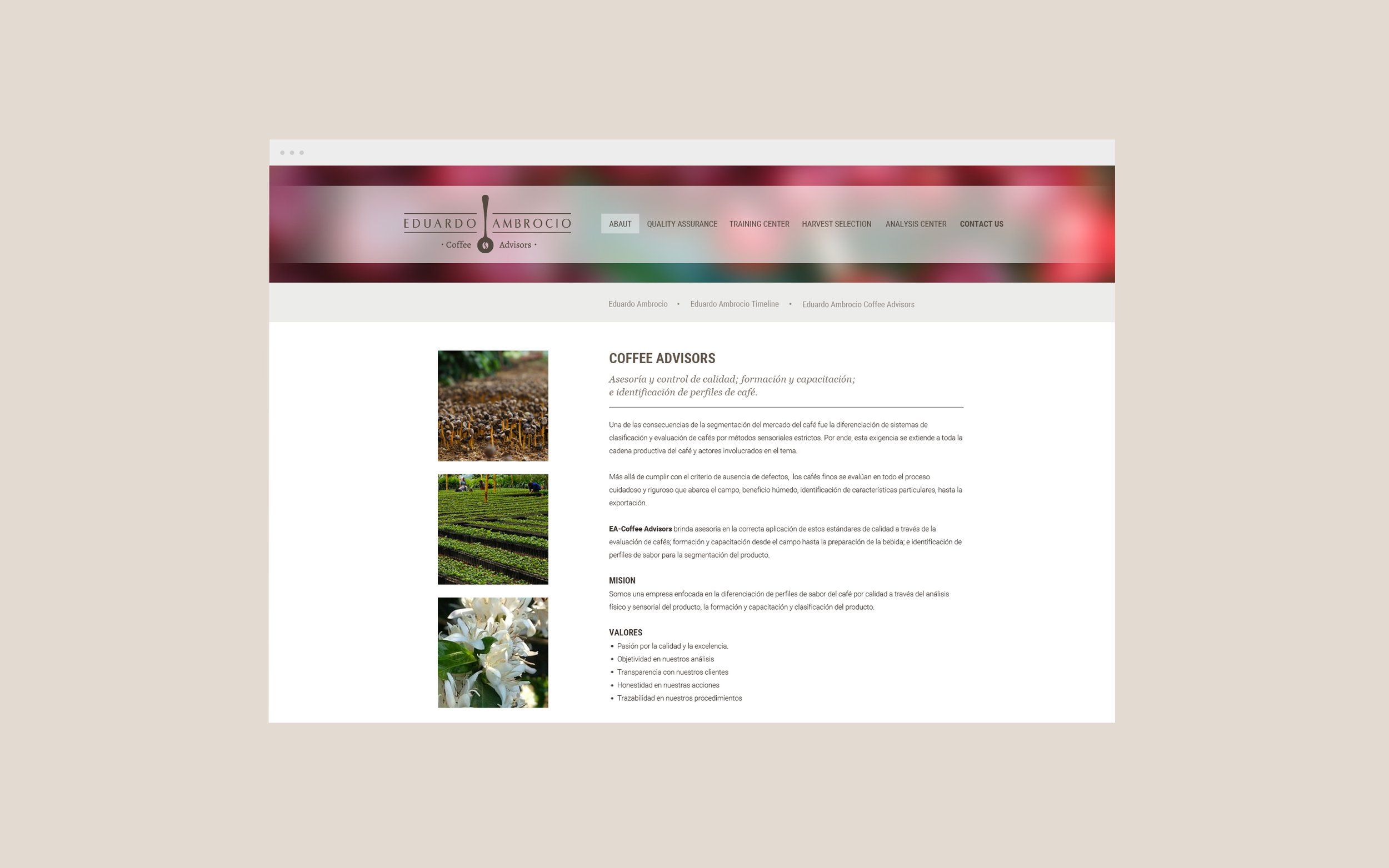
Eduardo Ambrocio
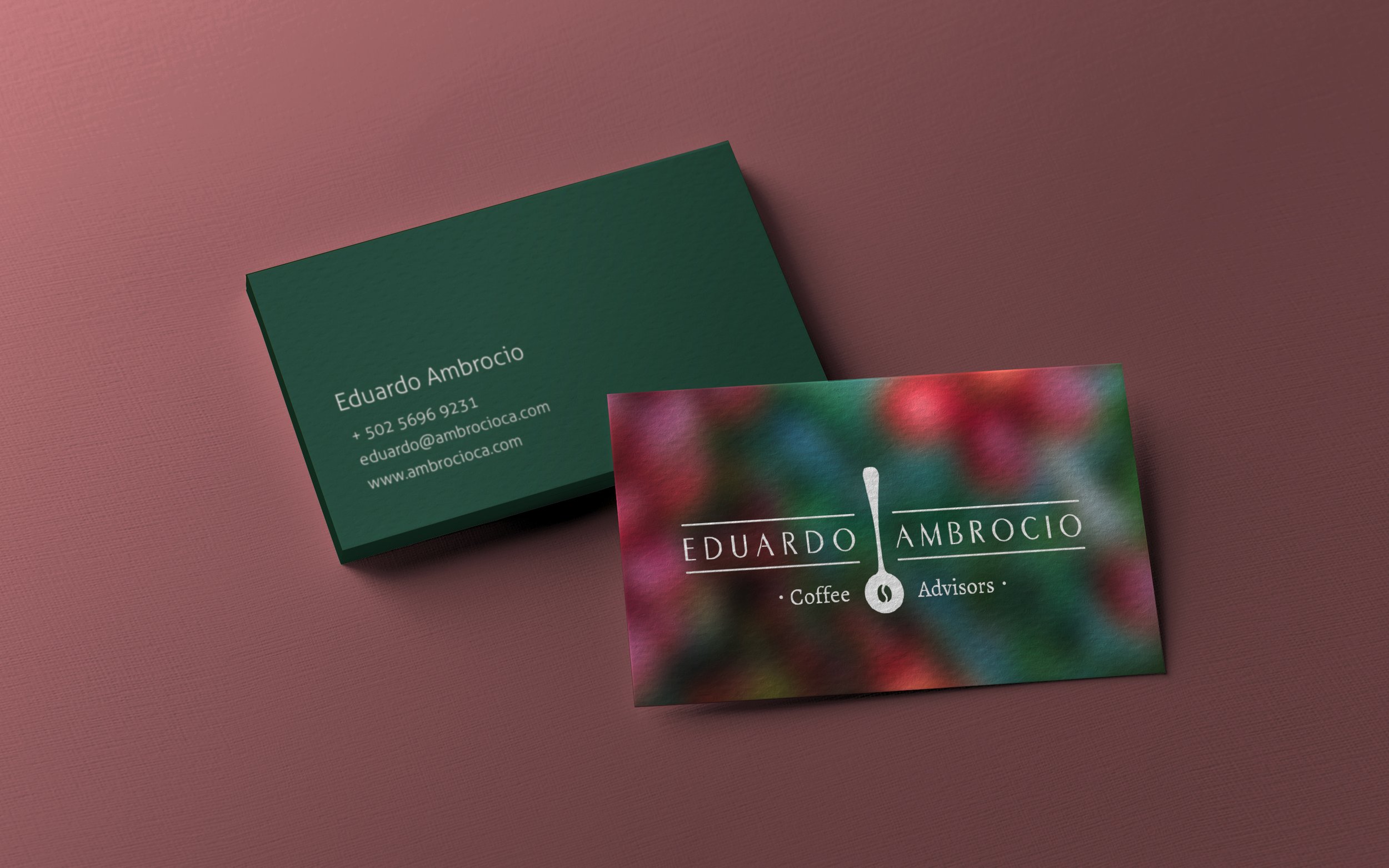
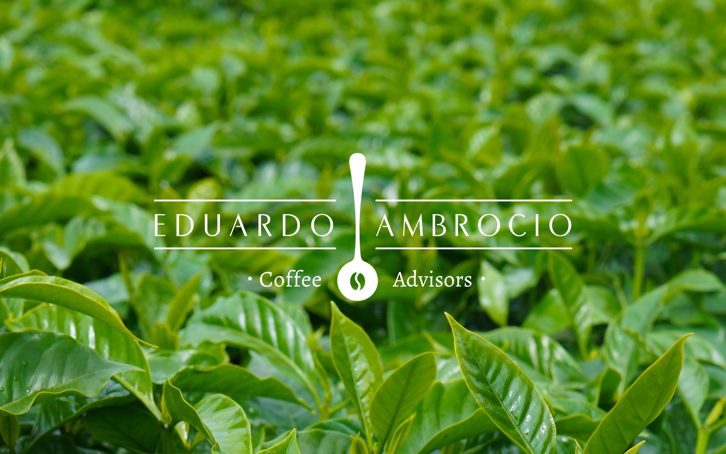
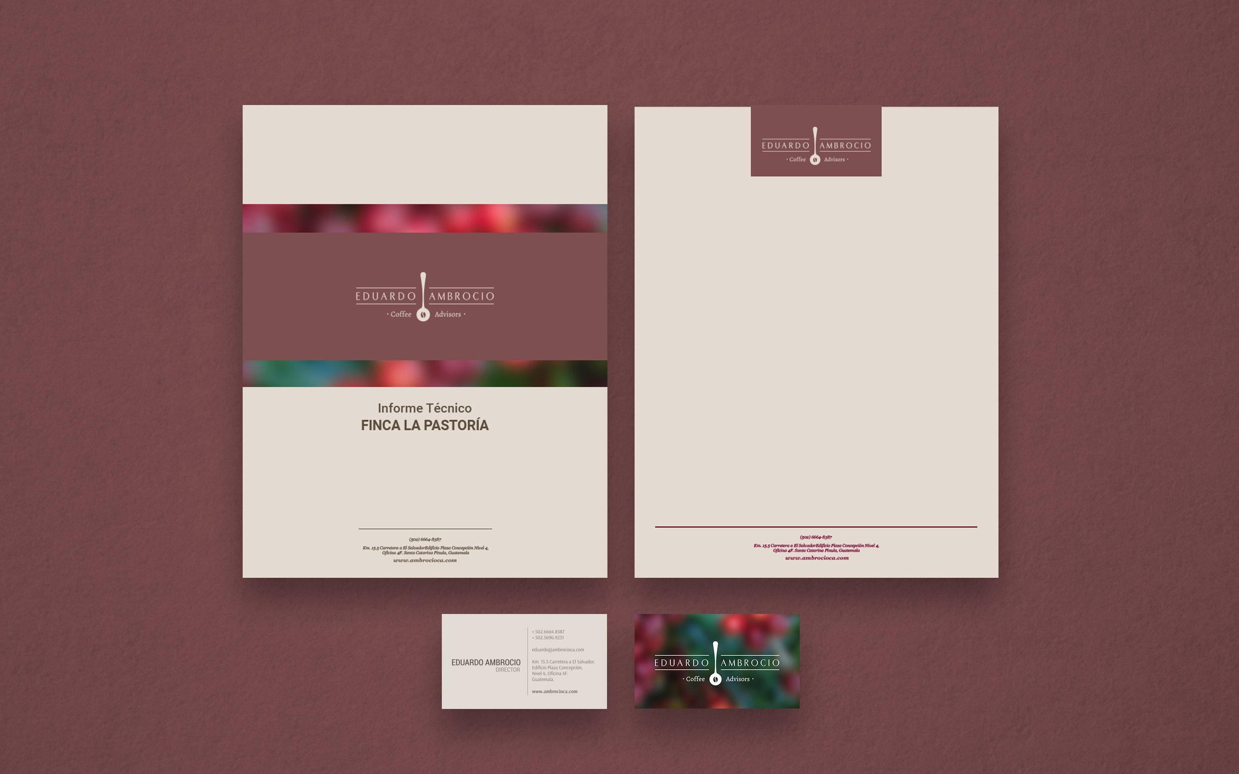
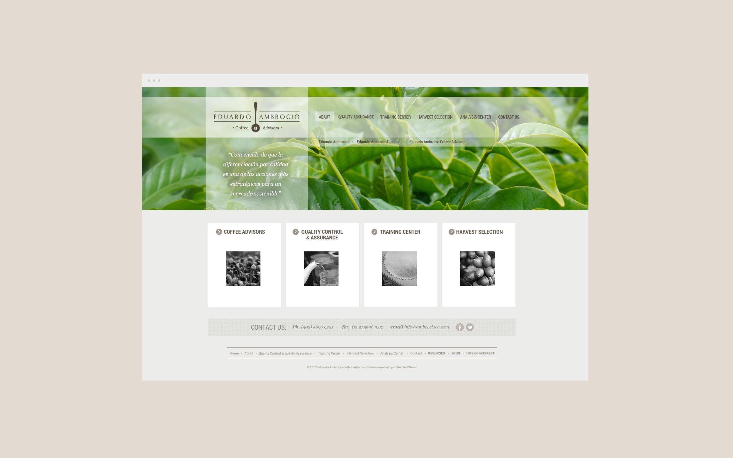
A minimal yet elegant logo, a warm color pallete, and stylized typography, altogether reflect the exclusiveness and dedication Eduardo Ambrocio services. My work started with the definition of a brief, shaping a personality, logo design, color and typography definition. Then, as the budget was very limited, we used photographs that my costumer had taken, which fortunately are quite good illustrating the different stages of coffee harvesting and cupping. Therefore, I used this images as the main element, searching for crops that would show the natural appeal and beauty of the coffee.
Having sorted all the assets and personality I designed the stationary, a Facebook’s fan page and a website. For the website I designed the wireframe and layout, then delivered the ready image files to a programmer partner.